12 Color Combinations That Create Calm
This post may contain affiliate links which means I may receive a commission for purchases made through links at no extra cost to you. I only recommend products I truly believe in. Thank you for your support!
Have you ever walked into a room and instantly felt at ease? Chances are, the color palette played a huge role in setting that mood! Today, we’re diving into the magic of color combinations that can transform any space into a serene retreat. Whether you’re redesigning your bedroom or refreshing your living area, these expert-approved design tips will guide you to tranquility.
Painting is more than just a DIY project—it’s a powerful tool to reshape your environment. Designers like Max Humphrey and Julie Daele swear by the impact of hue and tone in crafting calm interiors. Imagine pairing soft beige with muted blue for a soothing ambiance or using gray as a neutral base to balance bold accents like orange.
Ready to give your home a refresh? This guide covers everything from color psychology to practical tips for every room. Even a small shift in shade can make a big difference. Let’s explore these stunning palettes together and turn your space into a haven of calm!
Exploring the Impact of Color on Mood and Space

Have you ever noticed how a particular room makes you feel? Maybe it’s the cozy warmth of your living room or the serene tranquility of your bedroom. The secret lies in the color palette and how it influences our emotions. Colors are more than just a visual element—they shape our mood and the energy of a space.
Understanding Color Psychology in Home Design
Colors have a profound psychological impact. For instance, soft blues and greens are known to create a calming effect, making them perfect for bedrooms. On the other hand, warm oranges and yellows can energize a room, ideal for kitchens and family spaces. Designers often use these principles to craft interiors that align with the desired mood.
How Paint and Shade Transform a Room
The right shade can completely change the vibe of a room. A light gray paired with a soft pink accent can create a balanced, peaceful atmosphere. Even a small shift in tone can make a space feel more inviting. Think about it—what colors make you feel most relaxed in your home?
By thoughtfully choosing your color combinations, you can design a home that not only looks beautiful but also feels like a haven of peace. Ready to explore some stunning palettes that can transform your space? Let’s dive in!
12 Color Combinations That Create Calm

Imagine stepping into a space where every color feels like a breath of fresh air. Today, we’ll explore 12 handpicked color combinations designed to bring peace into your home. From soft coastal hues to bold contrasts, these palettes are perfect for any room.
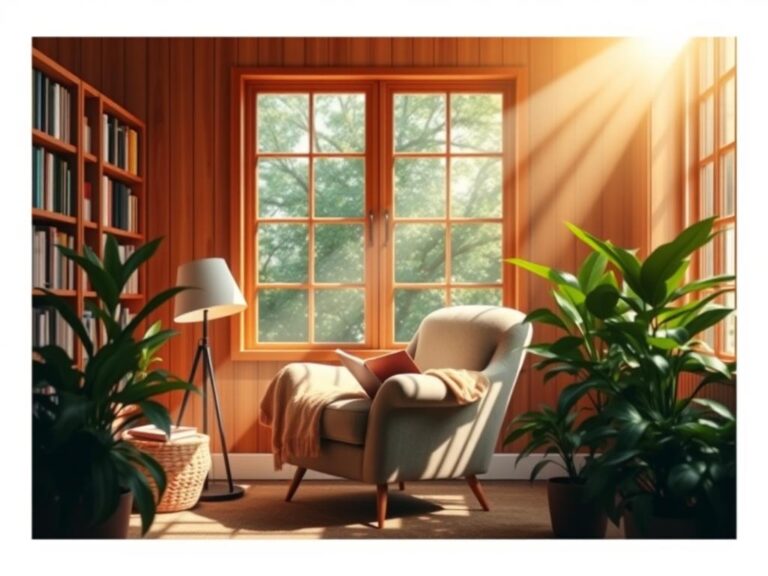
Coastal Neutrals & Pastels
Bring the beach vibe home with soft blues and creamy whites. Pairing light beige with pastel pink creates a serene ambiance, reminiscent of a seaside escape. Designers love these calming tones for bedrooms and living areas.
Warm Earth Tones and Soft Accents
Ground your space with warm earth tones like terracotta and sage. Adding subtle accents such as muted teal brings depth without overwhelming the senses. These natural hues are ideal for creating a cozy atmosphere in any setting.
Bold Yet Soothing Contrasts
Believe it or not, bold contrasts can be calming when balanced. For instance, deep navy blue paired with soft peach creates a striking yet tranquil look. This combination works beautifully in dining rooms or entryways, adding a touch of sophistication.
| Palette | Colors | Best For |
|---|---|---|
| Coastal Breeze | Light Blue, Beige, Pastel Pink | Bedrooms, Living Rooms |
| Earth Embrace | Terracotta, Sage, Muted Teal | Kitchens, Dining Areas |
| Bold Harmony | Deep Navy, Soft Peach | Entryways, Dining Rooms |
These palettes are not just visually appealing but also emotionally uplifting. Whether you’re redesigning your entire home or just a single room, these color combinations will help you achieve the calm and serenity you desire.
Designing Room-Specific Palettes for a Serene Home

Have you ever thought about how different rooms in your home could have their own unique personalities? It’s all about crafting the right color palette for each space. Let’s explore how to create harmonious designs for every corner of your home.
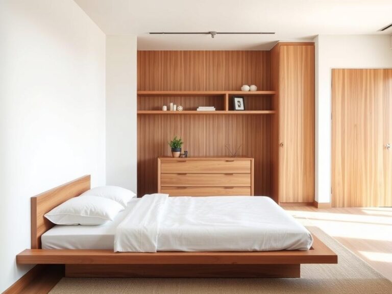
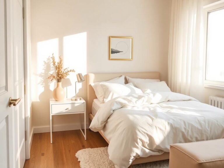
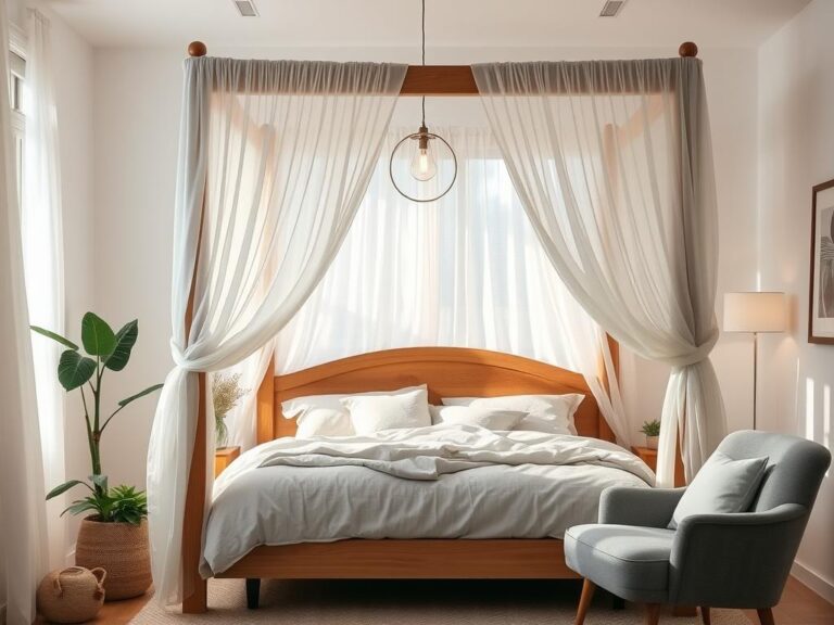
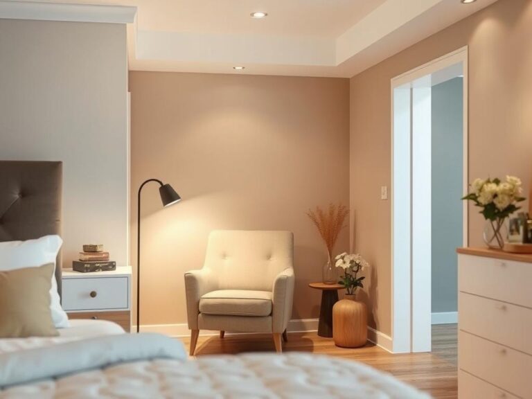
Bedroom and Living Room Inspirations
Your bedroom should be a retreat. Consider soft blues like Benjamin Moore’s Gray Owl, paired with warm neutrals for a cozy feel. In the living room, a mix of light grays and creamy whites creates a bright, inviting atmosphere. Add warmth with natural textiles like woven baskets or a jute rug.
Kid’s Rooms: Balancing Neutrals and Mood
Kid’s spaces can be both fun and serene. Start with a light gray base and add a pop of color with a vibrant wallpaper. This balance keeps the room playful yet peaceful. Plus, it’s easy to update as they grow!
Dining Areas with Natural Touches
Bring the outdoors in with natural hues. Sage green or muted terracotta paired with earthy tones like brown or beige creates a warm, welcoming dining area. These combinations are perfect for family gatherings or cozy nights in.
Remember, small changes can make a big difference. Whether it’s a new accent wall or a fresh color palette, your space can transform into a haven of serenity. What room in your home could use a little refresh?
Incorporating Meditation Color Palettes into Your Design

Creating a meditation space at home can be a transformative experience, especially when you incorporate thoughtful color palettes. These carefully curated hues can help you unwind and connect with your inner self, fostering a deeper sense of peace.
Creating a Dedicated Meditation Nook
A meditation nook is more than just a corner in your home—it’s a sanctuary. To create this peaceful retreat, consider using soft blues and greens, like those found in the “Tranquil Dawn” palette. These colors are known to promote relaxation and focus. Designers often recommend pairing light tones with natural textures, such as woven rugs or wood accents, to enhance the calming effect.
Another idea is to use the “Serene Ocean” palette, which features gradients of cool blues and greens. This combination mimics the soothing colors of nature, helping you feel more connected to the environment. Adding a small plant or a bowl of river stones can further enhance the natural ambiance.
Balancing Light, Dark, and Natural Hues
Balancing light and dark tones is key to creating a harmonious meditation space. For example, you can pair soft pastel pinks with muted grays for a balanced look. This contrast adds visual interest while maintaining a peaceful atmosphere. Natural hues, such as sage green or sandy beige, also play a crucial role in grounding the space and promoting relaxation.
Designer tips suggest maintaining a neutral base with subtle accents. For instance, a light gray wall can serve as a canvas for adding pops of color through pillows or artwork. This approach keeps the space visually engaging without overwhelming the senses.
| Palette | Colors | Best For |
|---|---|---|
| Tranquil Dawn | Soft Blues, Light Greens | Meditation Nooks, Small Spaces |
| Serene Ocean | Cool Blues, Muted Greens | Large Rooms, Open Areas |
| Natural Harmony | Sage Green, Sandy Beige | Grounding, Balance |
Remember, your meditation space is a personal sanctuary. By thoughtfully choosing your color palette and balancing light, dark, and natural hues, you can create an environment that nurtures both mind and body. Ready to get started? Turn your meditation nook into a peaceful retreat with these simple, actionable steps!
Wrapping Up Your Journey to a Calmer Home
Transforming your home into a serene retreat is easier than you think! By choosing the right color palette, you can create a space that feels both peaceful and inviting. Remember, it’s all about balancing tones and shades to craft an environment that reflects your personality and mood.
From soft blues that evoke tranquility to warm neutrals that bring comfort, the design possibilities are endless. Don’t be afraid to experiment with different combinations—like pairing deep navy with soft peach for a sophisticated look or using earthy tones to ground your space. Even a subtle shift in hue can make a big difference!
We hope you’ve enjoyed this journey into the world of color design! Whether you’re refreshing one room or redesigning your entire home, remember that small changes can lead to big transformations. Share your successes with us and let’s grow our serene spaces together!